

Three Mistakes You Didn't Know You Were Making On Your Website's Home Page
Look, we’re not here to patronise you – we know that you know how important your website is for appealing to modern shoppers. Unfortunately, while every company now knows that it needs to be online, not every brand is automatically performing in this area. In fact, the last few years of AI search and online shifts have seen many poorly executed company websites falling out of favour.
The pressure is undeniably on to create a website that performs, and that performance needs to hit its peak from the moment customers land on your home page. But did you know that a few fatal mistakes could be putting your online opportunities in jeopardy? Keep reading as we consider what they are.
#1 - A Messy Visual Hierarchy
Any web design agency will tell you one key thing when it comes to your homepage – it needs to look good. Visual hierarchy, which concerns where on the page things appear, is a major element in that. And if it’s off-kilter, you can bet you’ll start losing sales right off the bat.
A particularly common mistake here comes from trying to give every home page element its own moment in the sun. Visually speaking, that muddled hierarchy is guaranteed to look…well, a bit of a mess!
Instead, you need to implement a clear homepage hierarchy, which should highlight one consistent branded picture, alongside clear, concise, and well-organised chunks of text. This way, consumers will far more easily be able to decipher a home page that sends them on a journey, rather than jumbling their brains.
#2 - Too Much Text
What would you do if you clicked onto a website to be met with a wall of text right away? Would you keenly read on, or would you click off immediately? Most people would answer the latter, which is why you also need to be wary of placing too much text on your homepage.
Ultimately, customers don’t want your entire company backstory right off the bat. In fact, when heading to your homepage, they want to know one thing and one thing only: what do you have to offer? This is information that you should provide in a clear, concise line or two of text, which ensures customers have their answers in no longer than five seconds. This is a sure sign of a well-designed website, and guarantees that customers are far more likely to stick with you.
#3 - Making it too Vague
Note, too, that your home page will fail to land if it slips into mistakes like vague messaging, strange artsy photography, or a design that simply tries too hard to be clever.
Sure, a soft focus image of a pretty view is nice, but what’s it actually offering or telling your customer? Nothing. And if you have nothing to say, why should they stick around?
Instead, always make sure you’re leaning into specifics, like clear, carefully chosen product photography and text insertion. That way, you’re far more likely to land yourself some sales!
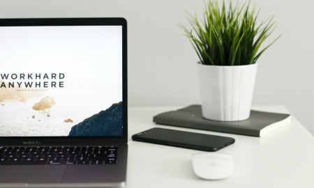
Image source: Kevin Bhagat via Unsplash.

